In this case the client is an established Chartered Accountant moving to his own practice. His goal was to create a website where his existing clients would be comfortable and have access to all his services while also providing information to new potential clients.
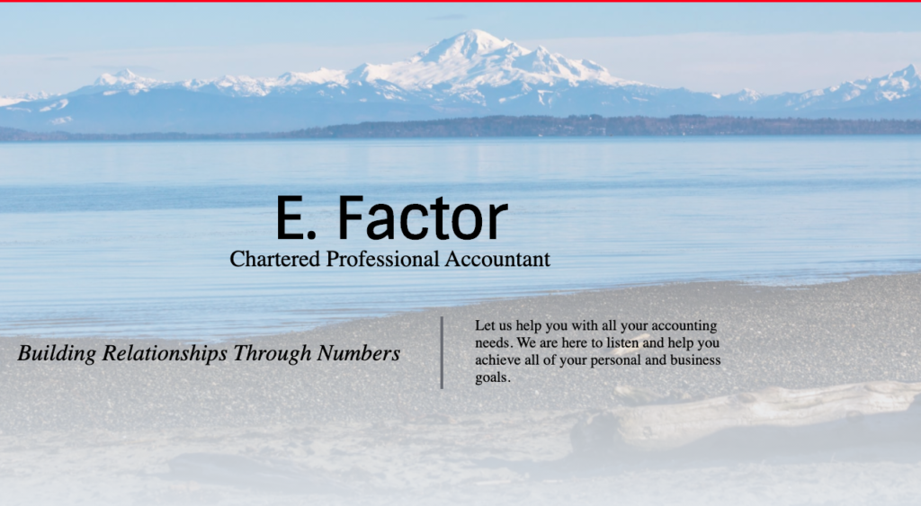
Researching the competition and considering design options we decided that the site should not depart too far from the pattern of the industry but look to add a fresher look and try to avoid the template look of many sites.
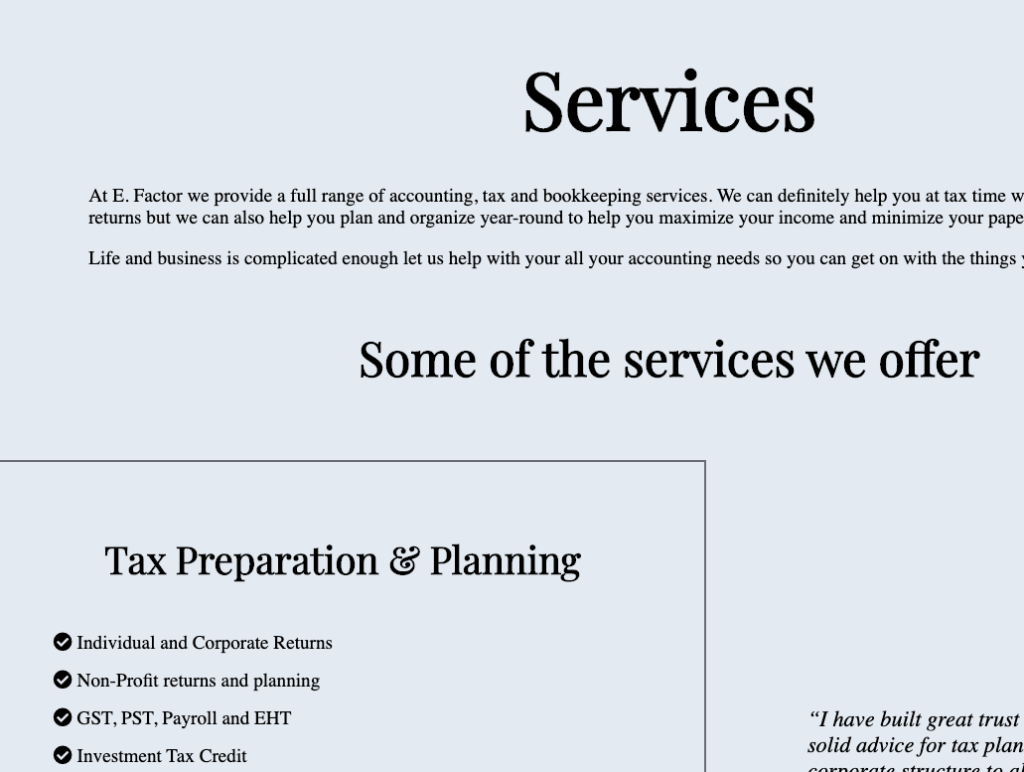
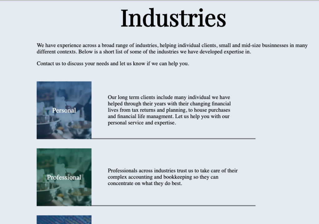
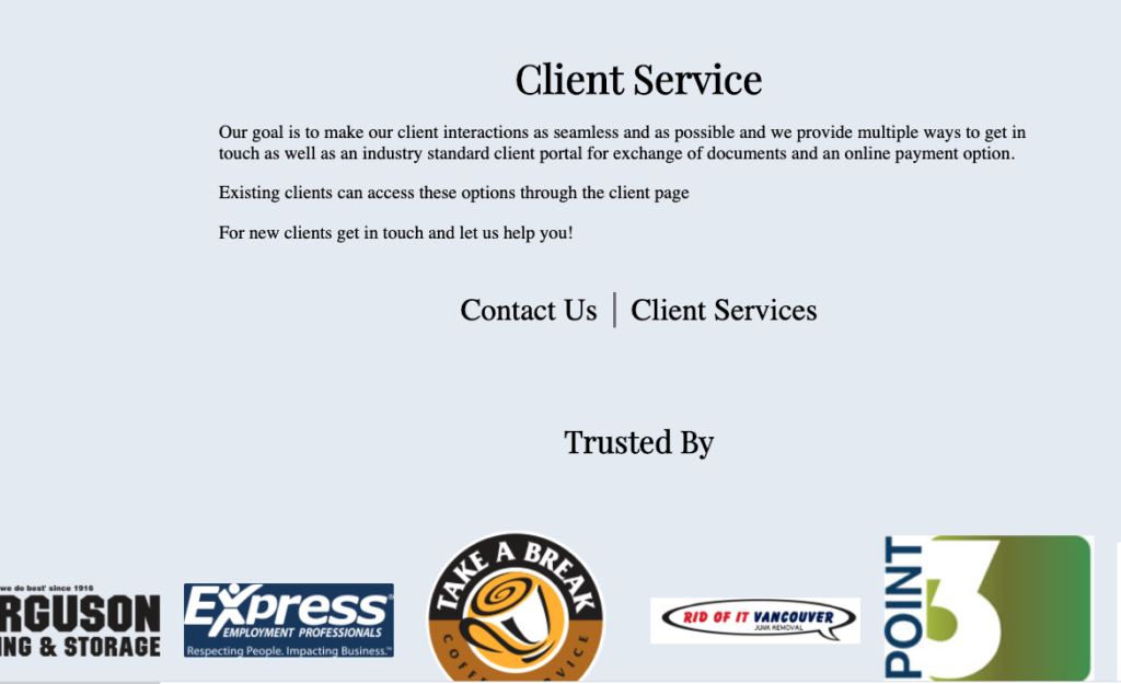
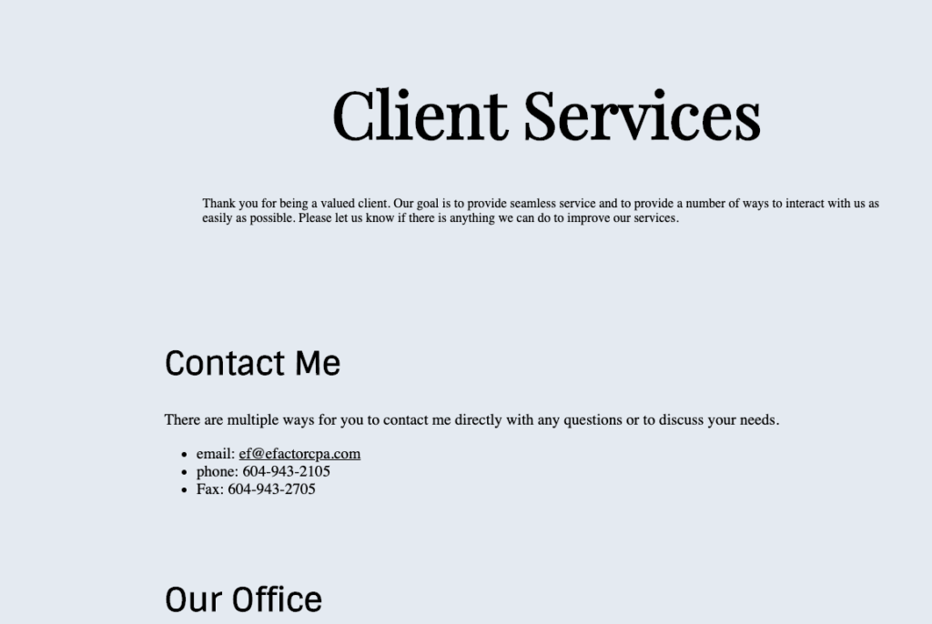
Features included a client payment option, contact and job application forms and links to a client portal.
The recognizable image of water and mountains helped to add a personal, local touch and colours and fonts aimed to give a fresh but professional impression.
